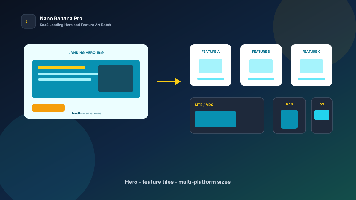
Nano Banana Pro SaaS Landing Hero & Feature Art
SaaS launches fear one thing most: a strong product dragged down by a scattered page. The first-screen hero looks like a collage, feature tiles each use a different filter, and the landing page, ads, and Open Graph need different ratios. Visitors close the tab before they catch the value proposition. Nano Banana Pro with Nano Banana img2img turns “one product reference + three template prompts” into a replicable SaaS landing-hero and feature-illustration batch workflow: lock the Landing Hero look first, then batch-extend feature selling-point art and multi-platform sizes. This article covers the full SOP.
Why SaaS Visuals Must Set the Hero Tone First, Then Layer Feature Art?
Many teams “reroll” every asset alone, so the first screen feels cold, feature cards go warm, and the ad vertical uses yet another illustration style. Visitors suspect several products stitched together. The scientific approach is to lock one high-recognition landing hero (Landing Hero) as the visual anchor, then copy the same palette, lighting, and icon language across every feature illustration.
Nano Banana Pro builds on the fast generation experience of Nano Banana and suits commercial growth cases that need clear UI metaphors, stable text safe zones, and readability on both desktop and mobile. Split the flow into three steps—hero tone-setting → feature-series extension → landing/ads/OG size pack—and you ship like a product-launch assembly line.
Workflow Overview: One Hero, Three Output Types
Follow strict order: after the Landing Hero is signed off, all feature and channel images carry similar color temperature and composition language so the site identity does not split. The three prompt templates below can be copied into Nano Banana / Nano Banana Pro—replace [brackets] with your product details.
| Stage | Output Type | Typical Use | Core Constraints |
|---|---|---|---|
| 1 | Landing hero Landing Hero | Site first screen, product page, press | Strong recognition; headline safe zone |
| 2 | Feature selling-point art | Feature section, pricing, help center | Unified style; benefits distinguishable |
| 3 | Multi-platform size pack | Ads / social / Open Graph | Compliant ratios; CTA not cropped |
Stage 1: Landing Hero (First-Screen Conversion Anchor)
Use for: SaaS site heroes, product pages, launch press images, and investor-deck covers.
Key steps:
- Pick the most representative product screenshot, brand palette, or concept sketch as the reference.
- Generate a 16:9 hero: lock the main palette and reserve safe zones for headline, subcopy, and CTA.
- Archive with a version name (e.g.
saas-hero-analytics-v1.png) as the full-site visual reference.
Based on the uploaded product reference, generate a SaaS landing hero: category [analytics / collaboration / automation / security], stable composition, subject [clean dashboard metaphor / workflow nodes / abstract data glow] centered slightly right;

Lock palette to [teal + amber / deep blue + cyan / brand primary], lighting [clean UI light / soft product studio];
Reserve the left 40% and bottom 18% as headline, benefit line, and CTA safe zones; forbid packing key UI details into text areas;
Quality suitable for site first screens and ad previews, tone consistent with Nano Banana SaaS visual standards: credible, clear, conversion-ready.
Pro tip: State clearly “palette lock” and “CTA safe zones,” or AI may fill the frame with a dashboard so the headline gets crushed. In Nano Banana Pro, img2img from a product screenshot keeps structure far more stable than pure txt2img.
Stage 2: Feature-Series Extension (Unified Feature-Section Tone)
After the hero sets the tone, batch by product module: core features, integrations, security, and customer-result cards.
Based on the uploaded landing-hero palette and lighting, process this feature reference into a same-site selling-point illustration: keep [same palette + same icon language], module [reports / collab / automation / permissions] distinguishable;

Requirements: match the hero style; forbid a new illustration style on every tile; graphics simple and readable; do not invent UI controls that do not exist;
Composition [1:1 centered icon scene], reserve the bottom for the feature name, suitable for **Nano Banana Pro** batch feature-section production.
Nano Banana multi-turn dialogue works well for micro-fixes: “simpler icons,” “more whitespace,” “unify color temperature”—faster than rewriting the full prompt. Fix feature order to lift browse completion:
- Landing hero: full-site recognition anchor
- Core features 3–4: same icon language
- Integrations / security: same palette, slightly more infographic
- Result-card backgrounds: more whitespace for metrics and customer names
Stage 3: Multi-Platform Size Pack (Landing, Ads, OG at Once)
After hero and feature art are locked, extend channel specs—avoid re-cropping per platform and cutting off the CTA or core metaphor. Prepare at least these per launch:
- 16:9 / 3:2: site first screen, blog header, press
- 1:1 / 4:5: social seeding, feed ads
- 9:16 / 1.91:1: short-video covers, Open Graph share images
Based on the uploaded landing hero, adapt to [target ratio: 16:9 / 3:2 / 1:1 / 4:5 / 9:16 / 1.91:1] SaaS placement size;

Strictly preserve main palette, product metaphor, and clean tone; only adjust crop and whitespace by ratio;
[9:16 only] keep headline and CTA clear of the bottom 18% subtitle/button zone;
[1.91:1 only] keep left-side headline depth; avoid cropping into an information-free close-up;
Output ready for sites and ads, style consistent with Nano Banana SaaS standards.
Brand Consistency: One Product Must Not Look Like Three Companies
The most common batch SaaS-visual failure is a new color temperature on every feature tile. When building product / growth libraries in Nano Banana Pro, lock these habits:
- Same palette line: e.g. all “teal ground + amber highlights”
- Same safe-zone rules: reserve left or bottom for headline and CTA
- Fixed suffix line: “Consistent with Nano Banana SaaS visual standards: credible, readable, no over-flash”
For “before vs after redesign” comparisons, clearly label Before/After and keep verifiable original screenshots for legal and brand review.
Batch Checklist (Countdown to Launch Day)
Count backward from launch day:
| Day | Task | Tool |
|---|---|---|
| D-10 | Lock value prop, palette, UI references, and feature list | Sheet / mood board |
| D-7 | Generate the landing hero (Template 1) and lock the look | Nano Banana Pro |
| D-5 | Batch feature selling-point illustrations (Template 2) | Nano Banana Pro |
| D-3 | Extend landing / ads / OG sizes (Template 3) | Nano Banana |
| D-2 | Copy overlay export and per-channel spec QA | Design tools |
| D-0 | Publish the landing page and sync ad assets | Growth |
Efficiency reference: Once fluent, one mid-size launch yields about 10–18 finished frames (hero + features + size pack); first drafts can finish in 2–3 days. Teams using Nano Banana Pro shared templates also reduce site fracture from designers applying their own illustration styles.
Case Study: Growth Team Ready a Full Launch Visual Pack in 4 Days
A B2B SaaS needed a new-version landing page live next Monday; the freelance designer had a scheduling conflict, and old assets looked dark on mobile first screens with inconsistent feature-card styles.
- Input: 6 product screenshots + brand palette + 4 feature selling points
- Step 1: Stage 1 template made a teal + amber hero with headline and CTA zones
- Step 2: Extended 4 feature illustrations and 1 result-card background in the same palette
- Step 3: Extended 1:1 ad art and 1.91:1 Open Graph
- Output: Copy-ready launch pack, entire pipeline in Nano Banana
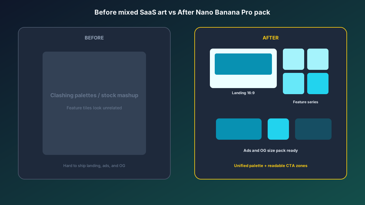
Growth lead feedback: first-screen dwell and signup clicks rose clearly versus old art; sales felt “the site and ads are the same product”; production cost was far below rush freelancers. Structured prompts + stable Nano Banana Pro img2img let the team spend time on copy tests and channel spend.
Conclusion: Leave Trust to the Product, Leave Imaging to the Workflow
SaaS competition is about first-screen credibility and series memory. When assets shift from “wait for a designer slot” to “hero + template extension,” growth teams catch launch windows faster. Nano Banana Pro and Nano Banana fit as the execution engine for this product SOP—not faking UI, but helping real capability be seen more clearly and extended more stably.
Before the next release, lock the Landing Hero first, then open the three templates—you will find SaaS batch imaging in Nano Banana as clear and controllable as a launch checklist.
FAQ
Q: Will the product UI look too fake and trigger customer doubt?
A: Always keep real screenshot references and state “do not invent controls or data that do not exist.” Archive finals with original UI for review; Nano Banana Pro img2img stays closer to the real product than pure txt2img.
Q: The headline covers the core metaphor after overlay—what then?
A: Emphasize in the prompt “reserve headline and CTA safe zones.” Spot-check more with type overlays at the hero stage; only then batch feature art.
Q: How should Nano Banana and Nano Banana Pro divide work?
A: Nano Banana Pro for hero sign-off and high-demand consistency; Nano Banana for feature-series extension and size micro-fixes. Templates are shared—pick the entry by account access.